photoshop logo illustrator logo adobe xd logo

Join RE/MAX is designed to create a frictionless experience for real estate agents looking to join a firm. The site aims to present the agency's unique benefits in a way that is visually compelling and easy to comprehend.

  • Art Direction and Design
  • Research, UX/UI Design

My Role

  • Wireframes
  • High-Fidelity Prototypes
  • Solo Project

Project Specs

Art Direction & Design

Research, UX/UI Design

My Role

Wireframes

Site Prototype

Solo Project

Project Specs

mockup of finished website

1 - Introduction

Real estate is a saturated market with a choice of firms available to the prospective agent. Join RE/MAX distinguishes itself from the market by highlighting the unique benefits of its brokerage in a way that is both engaging and visually appealing.

This project worked to address the needs of the client—RE/MAX Millennium—and provide a visual and logical refresh of their existing agent recruitment site. With special mind paid to the RE/MAX guidelines, the redesign worked to provide a fresh take on a familiar design without sacrificing practicality or brand integrity.

2 - Research

magnifying glass icon
Click On An Image To Enlarge

A competitive analysis was conducted using the SWOT model to determine opportunities for growth and innovation for the client's existing site.

Client's greatest weakness is their independent brokerage status that distinguishes it from the "official" RE/MAX. The site must work to establish brand awareness and trust, superseding the comfort and security offered by the official brand.

Client's greatest strength is their site's existing SEO optimization lending to its predominance in in returned search queries. This is advantageous as agents blindly querying RE/MAX are more likely to stumble upon the client's page by chance.

a picture depicting the problem areas in pink

A web audit was conducted on the existing site. Overall impressions, areas of strengths and weaknesses, brand compliancy, informational hierarchy, and ease of use were amongst the factors considered.

First impressions of the existing site are that it is generally easy to navigate with a brand-compliant design. A more robust investigation of the site lends to some glaring problem areas (visualized above using the pink dots): a severe lack of poignant and impactful visuals, overall heavily-saturated text with some redundant information, and an overall lack of visual intrigue.

3 - Ideation

user personas for the project

The recruitment site acts as the digital face of the brokerage in promoting its services to agents. Catering towards this target audience meant certain demographic and psychosocial factors had to be considered.

Considering the age of the average real-estate agent to be in the 40s-60s range, this demographic's proficiency in web-related services was heavily considered in redesign. Pain points that may act as barriers to communication were eradicated by: remapping the site and re-organizing its hierarchy, adding more visuals, and reducing text to make the consumption of content easier and more readily accessible.

Informing the redesign were three user personas constructed from statistical data pertinent to the average real-estate agent, in addition to key data provided by the client; primarily the distinction between the two common types of agent: the new agent and transfer agent. In order to accommodate the breadth of needs required by both types of real-estate agent, their varied circumstances were considered.

4 - Prototypes

mockup image of website screens

A design that distinguishes itself from the competition through modern design, clean logical hierarchy, and key visuals.

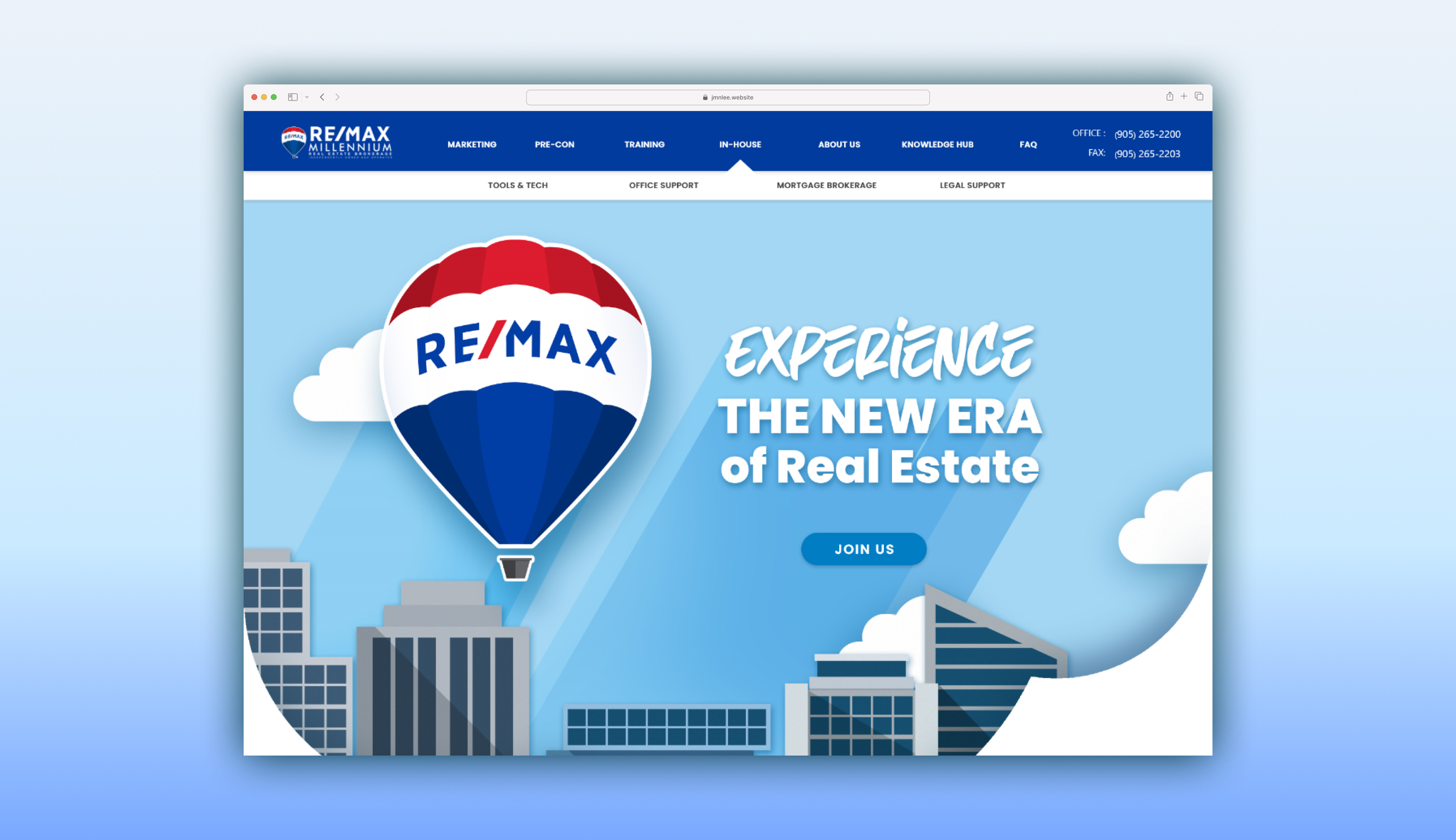
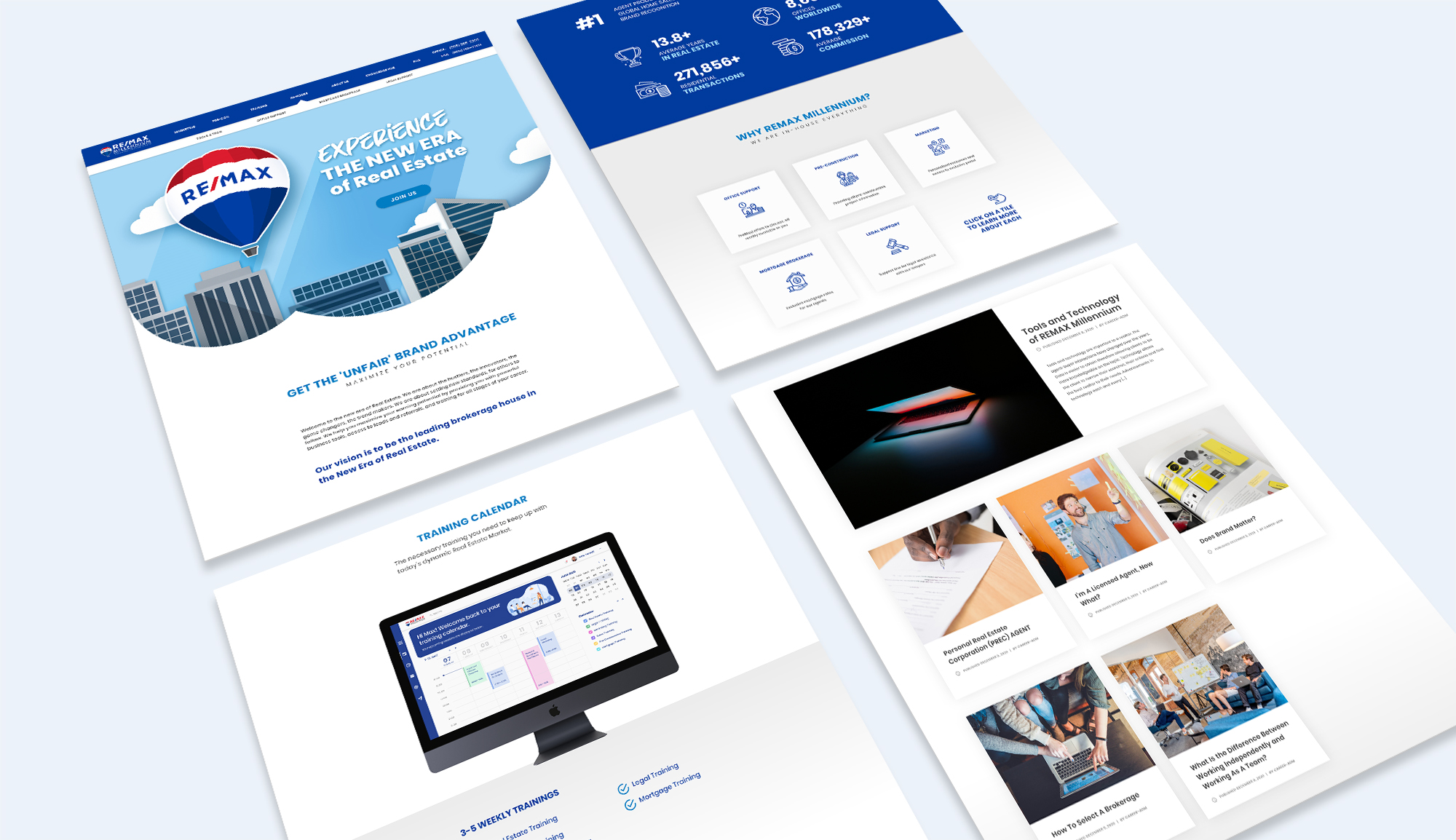
High-fidelity prototypes were designed using Adobe Xd. The redesign accounted for the shortcomings of the original design by eliminating the pain points identified in the web audit earlier in the research phase. An overview of the changes made: redundancy reduced, brand-appropriate visuals incorporated to enhance the overall viewing experience, and subtle tweaks to smooth out navigation and organizational hierarchy.

Additionally, the site's visual identity has been re-imagined with a modern colour palette that manages to abide by the existing RE/MAX branding whilst promoting brand trust through its varying shades of blue.

image of website navigation

Smooth and intuitive navigation. Browse with ease.

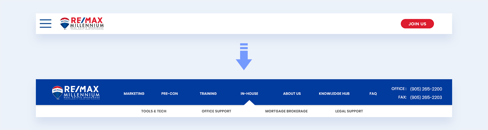
Discoverability has been greatly enhanced with the navigation menu redesign. The new menu provides a precursory glance at the site architecture and makes navigating the site easy and intuitive. Additionally, a secondary menu has been added with an indicative arrow to signify the child menu's contextual relation to the parental menu of "In-House" services.

Additionally, the business contact information (previously located in the footer) was moved to the header for easier access. Redundant information has been removed for overall cleanliness.

a GIF demonstrating the tile hover functionality

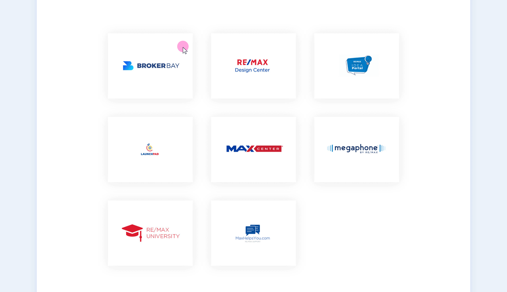
Information has been organized into containers to allow for the logical categorization of information whilst simultaneously providing feedback to user interaction.

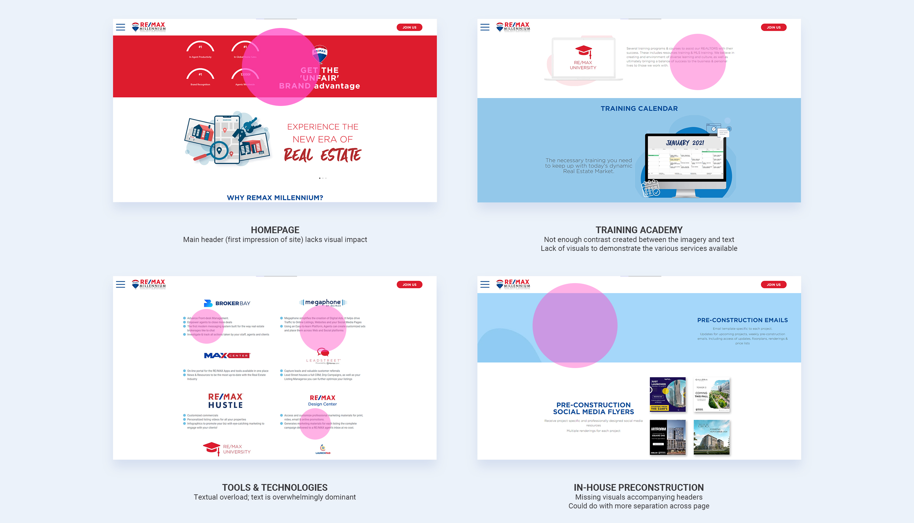
The tools page has been redesigned as individual containers with the logo overlaid the front-facing portion with additional detail revealed upon hover. This solution was doubly effective as it acknowledged user autonomy, hiding extraneous detail prior to the user interacting with the element. This solution allows for an overall "cleaner" look without sacrificing any of the secondary information that may provide users with additional details regarding the services provided.

a GIF demonstrating the video snippet functionality

Interactive components have been added to encourage user interaction and to demonstrate the perks of the brokerage in a way that is visually impactful and informative.

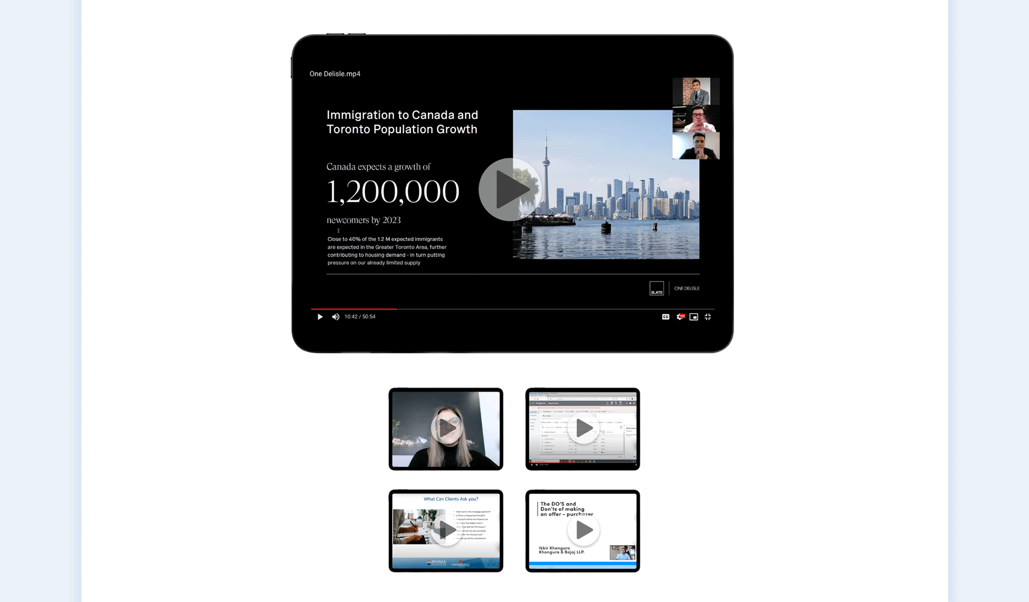
The "In-House Training Academy" pages (pictured above) has implemented a video snippets grid to allow the user to toggle through various training modules provided by the brokerage. This solution was implemented as it provides a simple way to experience the content without forfeiting its exclusivity.

5 - Revisions

Throughout the process I reported to the Design and Marketing Leads and adjusted the design and structure according to their feedback.

The Design and Marketing leads acted as the cornerstone throughout the redesign process, providing valuable insights regarding their existing website as well as key pointers regarding their target demographic—all information that was duly noted and referenced to make a viable product addressing the client's key concerns in the most effective way possible.

Design feedback included pointers regarding the re-organization of content as well as some design functionality. Feedback received was noted and implemented in future iterations of the project.

Try the Interactive Prototype >

Prev Project
OmegaAI
Go Home
Next Project
Pixapple