Art Direction & Design
Research, UX/UI Design
My Role
Brand Book & Assets
High-Fidelity Prototypes
Solo Project
Project Specs
More and more body modification is being viewed as "trendy" and is increasingly accepted in more professional circles. The influence of celebrities and popular culture is a major driving force in this area, popularizing the use of tattoos and piercings as a form of self-expression rather than as a means of rebellion. Despite this shift, however, the visual identity of body modification services remains quite stagnant, rooted in its history of punk and reactivist culture.
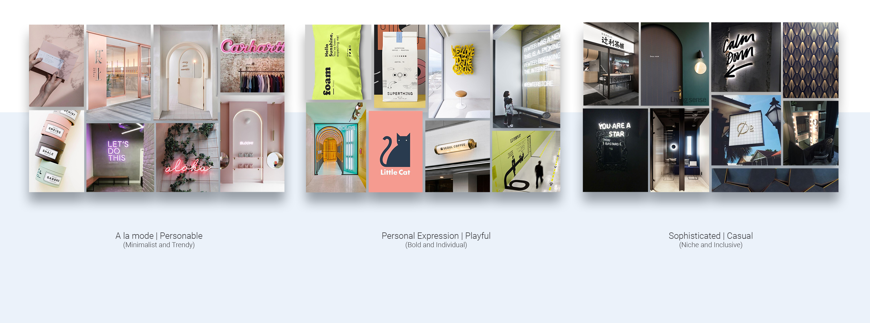
The exploration stage consisted of orienting the new business in an already saturated industry by establishing a brand philosophy and curating moodboards for visual concept exploration. Three brand directions were proposed: a minimalist design concept with a focus on trend and fashion (pictured far left), a playful concept with a focus on individuality and fearless self-expression (centre), and a more niche approach that touted specialty services—namely specialty inks for those allergic to traditional tattooing inks.
Despite the strong contenders, the most popularly voted concept was the personal expression angle accented by the bright neons.
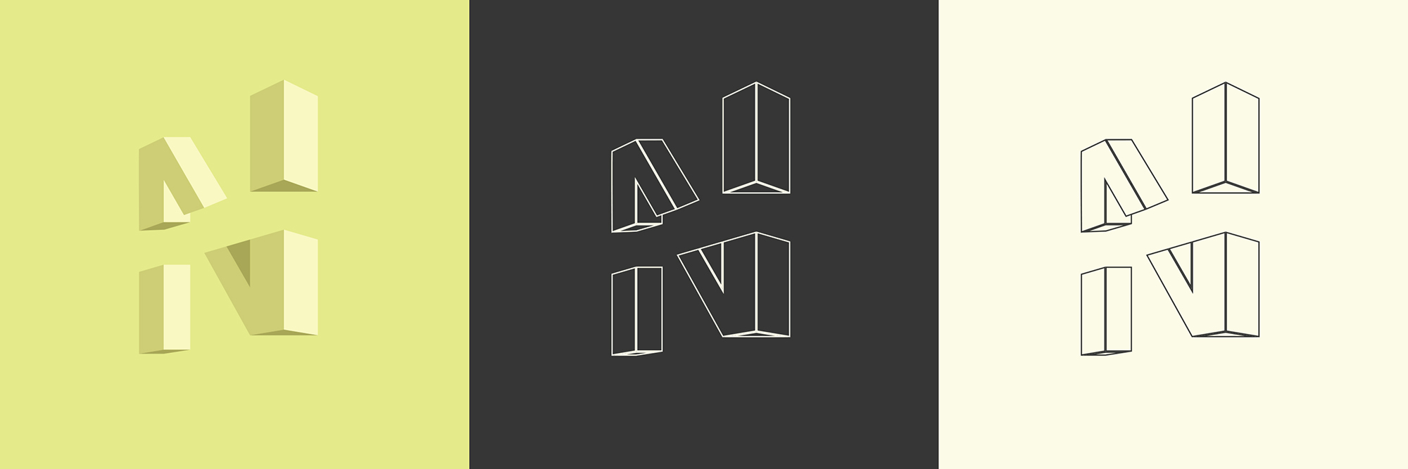
There is a certain duality to the art of body modification. There is the idealized version of the self as one envisions it and the "real" current self. Through the art of body modification, the gap between these two forms is minimized as one achieves the look that they have always envisioned. The logo captures this duality as it can simultaneously be read as an "N" for Neo or inverted "Z" for Zone. Additionally, the separation of the segmented parts lends the logo another dimension as the forms may be read as individual geometric pieces or unified as a singular letterform.
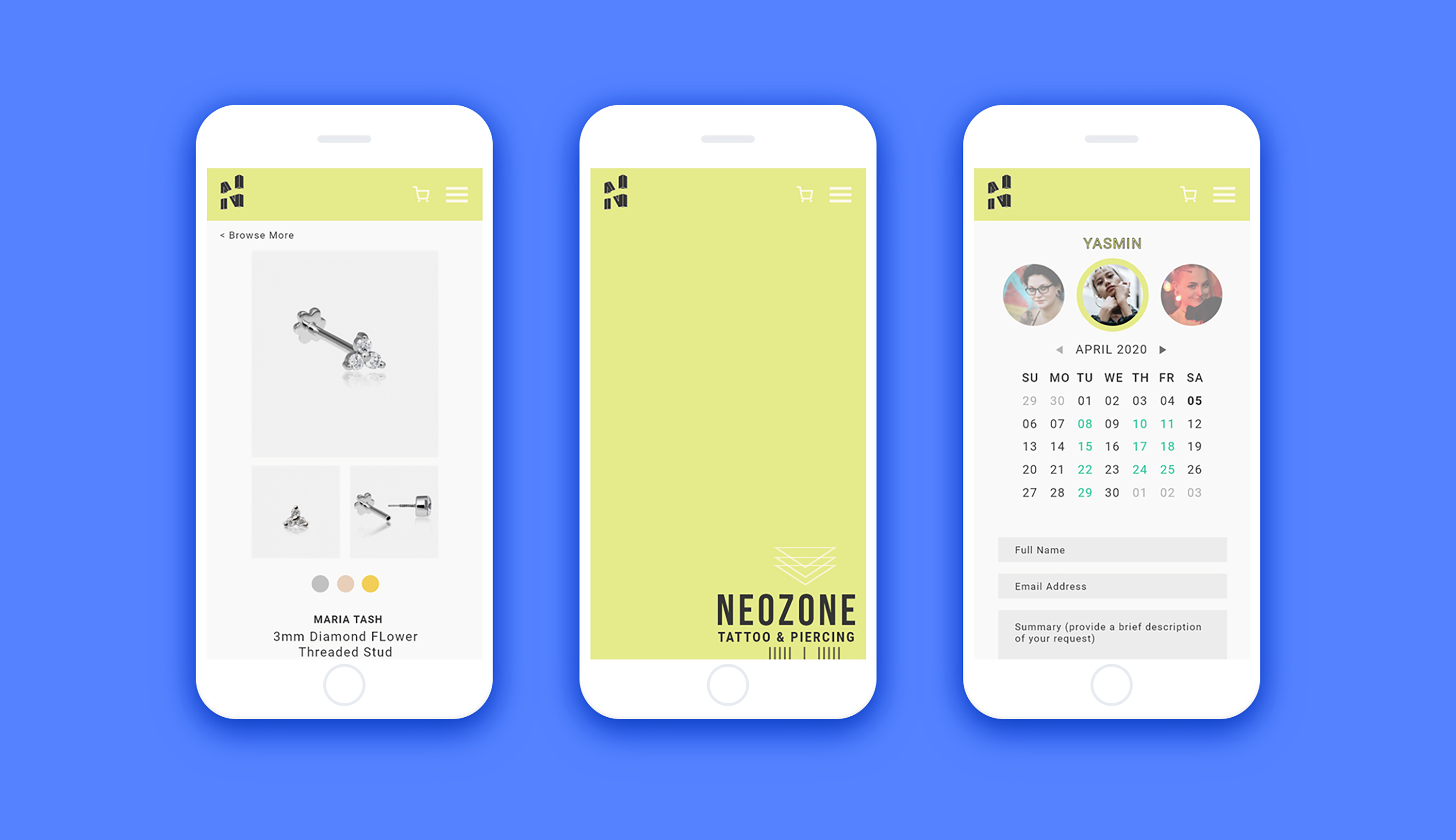
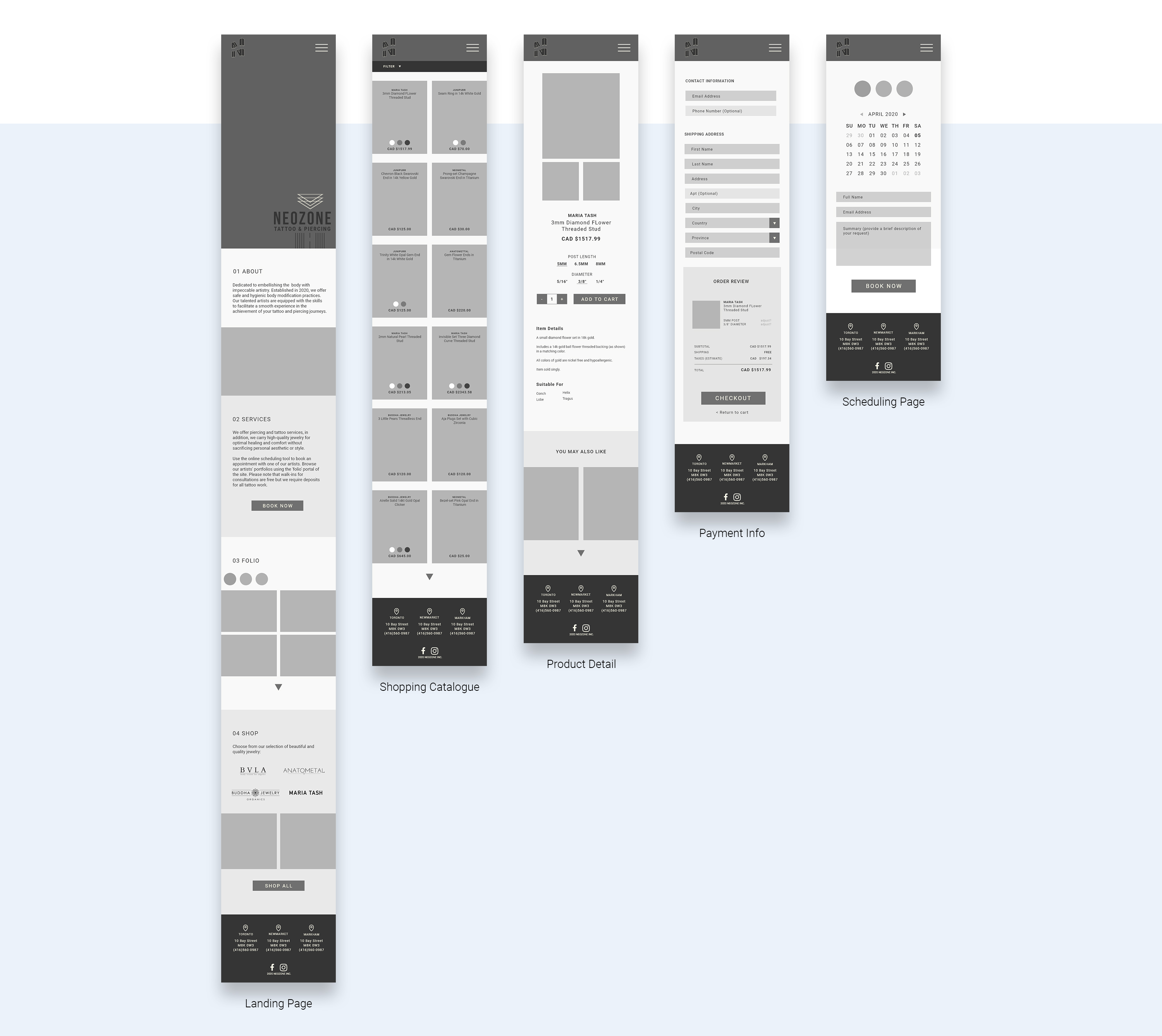
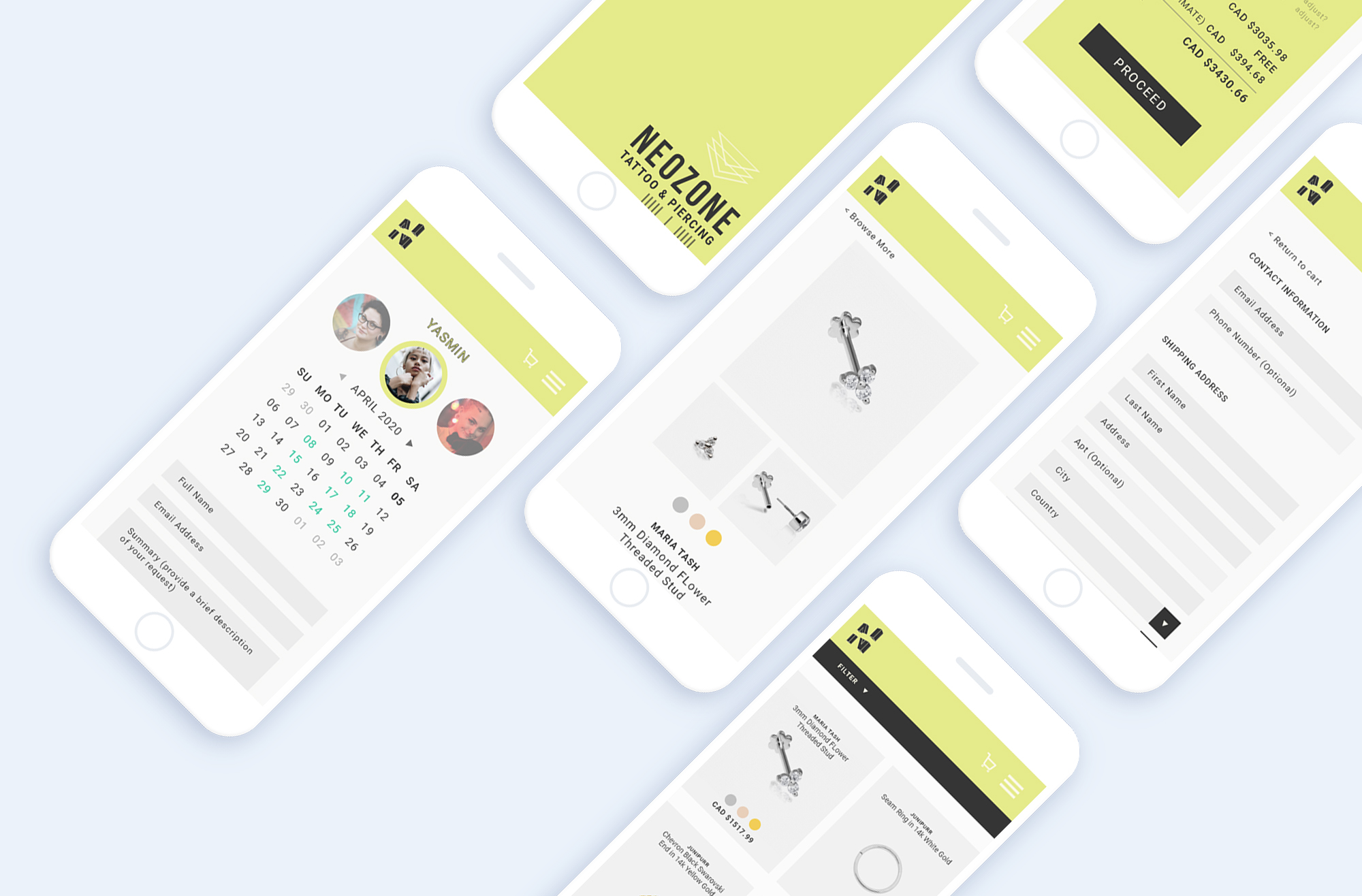
Neozone works to promote a wholly transparent and well-informed practice to ensure you make the right choices for your body. This brand philosophy carries across mediums to the mobile-friendly platform for their ecommerce site, as it relies on transparent pricing and a simple navigation experience to mitigate the frustrations of online shopping. The site opted for a long-scroll interface to minimize the number of page refreshes and redirects with an optional side menu with hyperlinks to key pages and interactions.
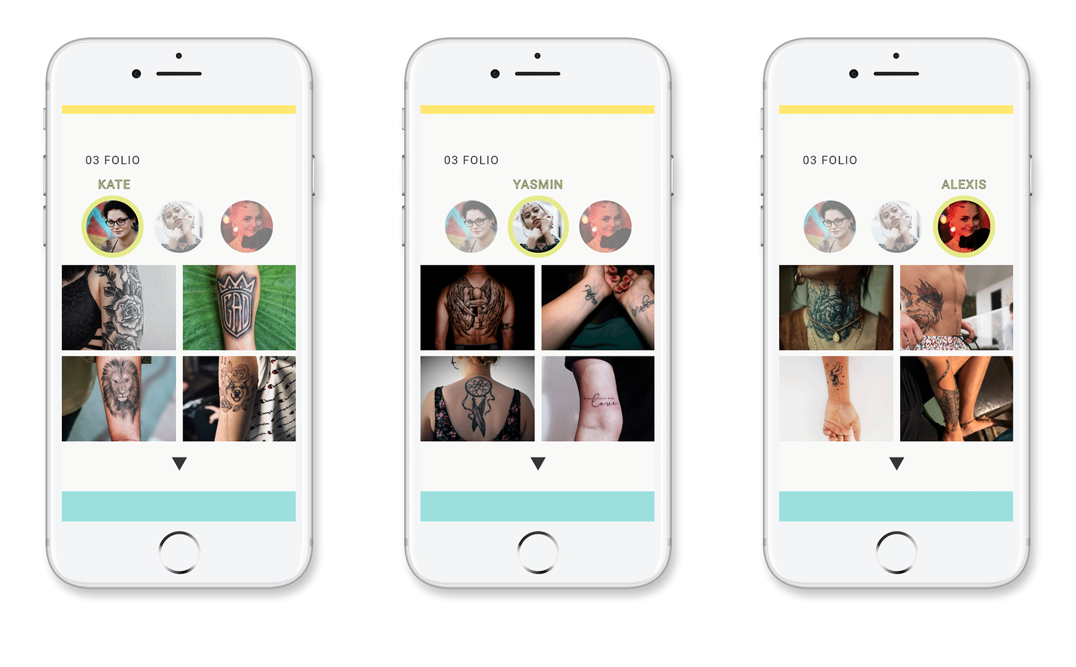
Choosing an artist is never an easy task. Browse artist portfolios through the interactive menu that lets you instantly toggle between each artist's portfolio. Get a sense of each artist's distinct style through the featured grid.
Want a closer look? Just click on any of the tiles to get a better look at each piece. And if you're still craving for more, make sure to expand their portfolio by clicking on the little arrow to get an even more extensive look.
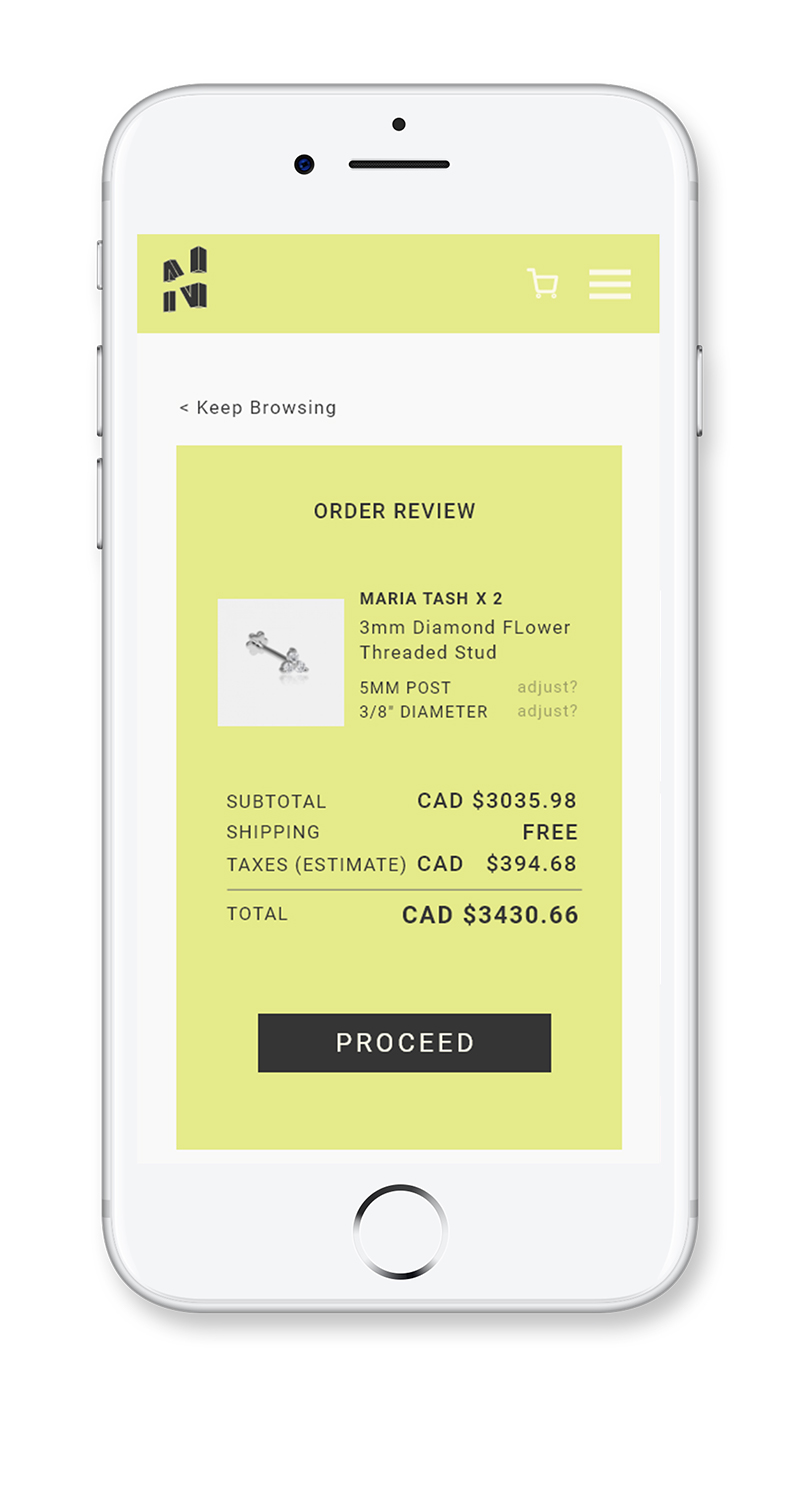
Review your order through the pre-checkout screen that breaks down the cost of your item. Any last minute changes that need to be made can be accessed through this menu; just click on the "Adjust" option to change according to your preference. Once you're satisfied, just click on the proceed button to enter your shipping details.
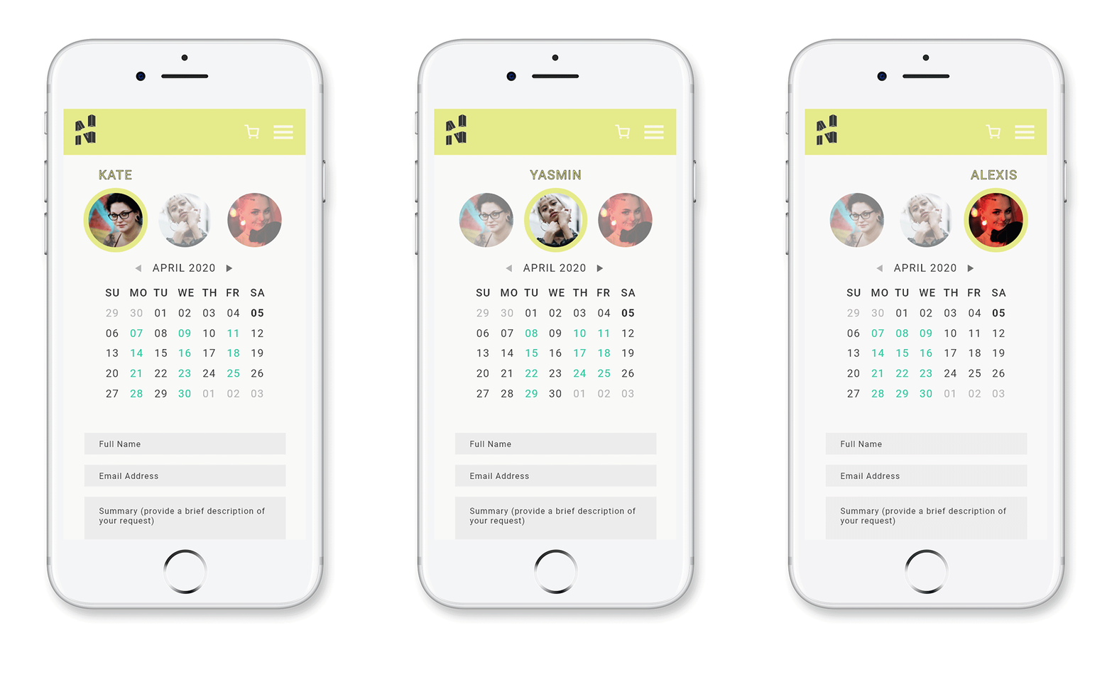
Scheduling an appointment is quick and easy, with a quick-toggle menu of artist portraits that cycle through available slots with a simple click. Select on any available date to bring up the available times and choose a time that works for you.
Laid out using the same artist-toggle menu from the portfolio screen for easy recall.
Try the Interactive Prototype >